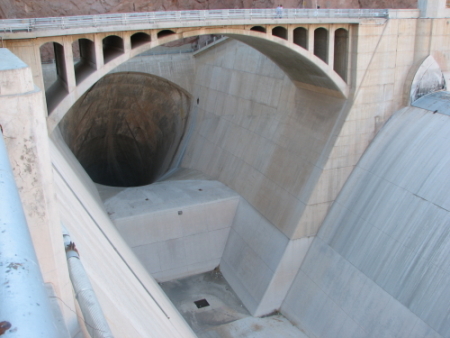
Well, this image looks interesting, but it is really fuzzy. I bet standing on that bridge and looking into that hole is scary. Nonetheless, I don't think this one nailed the concept of scaring the viewer.
3 - Good potential. Criticism; needs to be bigger (640 width in this case). For added 'effect', especially for this Challenge, a sharper perspective would have helped this in my opinion. Difficult to discern at this size, but focus doesn't seem very sharp.
On behalf of all of us lazy voters: your presentation would have been more viewer-friendly if your title included a brief definition of the phobia in addition to the technical word for it.






 Add photograph to your favorites
 Add photographer to your favorites


 Photographer found comment helpful.


