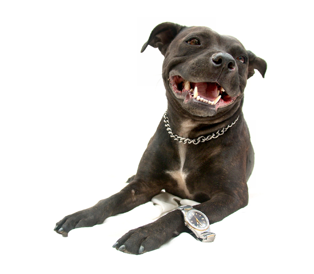
This is my dog. Her name is 'Misty'. She is a Staffordshire Terrier who loves to pose for the camera.
Auto Contrast.
Cloned out creases on sheet and edge of elbow.
Levels.
Brightness & Contrast on eyes.
Levels on claws.
Levels on mouth.
Levels on white part of the chest.
Cropped.
Resized.
This image was taken on 19 December 2005 Australian time.
Statistics
Place: 28 out of 144 Avg (all users): 6.1130 Avg (commenters): 7.3333 Avg (participants): 5.8415 Avg (non-participants): 6.2635 Views since voting: 3040 Views during voting: 420 Votes: 230 Comments: 15 Favorites: 3 (view)
::: Critique Club ::: Hey Kita, it's great to critique images that have a touch of humour. I'm loving Visual Puns for just that reason and yours looks more fun than most.
First Impression - the most important one: The first impression is that this is a badly cut out dog that was probably on a coloured background. Closer inspection reveals this isn't the case of course. She's cute and attractive and clearly is loved by the voters too.
Composition: Perfect use of the Rule of Thirds with the teeth right on the intersection. I'll talk about lens use in Technical but the visual part of the result is that it looks as if she has no back end which has added to the feeling that this is a bad cut out - which if course it isn't.
Subject: She's great. She's 'smiling', you can tell she loves hamming it up for the cameras. Despite them being the most attractive and popular of subjects, using animals and children have risks in DPC. This is because some peole use their cat/dog/child for every single challenge whether it fits or not. They just change the title. This is silly and it spoils it for perfect use that you have made of Misty here. The voters are not silly though, they have seen this too and have scored you well, very well.
Technical (Colour and light): Misty against the stark white is a very good idea given her colour and the contrast that makes. Looking just at her skin tones, she may be just a fraction overexposed, it's difficult to tell because on the other hand you don't want to loose the detail of her coat. It may be that the background is just too white, too stark. You've had lots of those comments from the voters too.
As mentioned before, one of the things that has contributed to the feeling of the cut out is the complete loss of her behind the shoulders. I suspect that the lens was quite wide angled which in portrait work this distorts heads making them appear much bigger than they are. In portraits the most common lens to use is surprising quite a long one between 85mm and 130mm. These lenses fore-shorten things like noses and puts them in their correct perspective. In this case, a longer lens may have given Misty a more normal proportional look whilst half a step to th e left would have shown a little rump and made the whole thing look more real.
To grow its vote?: With a vote of 6.1 and 28th place, it's boggling to imagine what this pic is capable of if people hadn't thought of it as a cutout.





 Add photograph to your favorites
 Add photographer to your favorites

 Photographer found comment helpful.


