Greetings from the Critique Club
by strangeghost
COMPOSITION
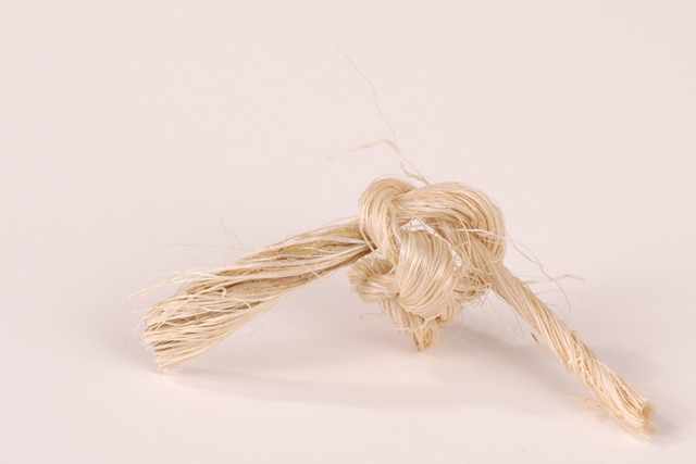
Great use of negative space and placement of your subject. The shadows are soft and pleasing. Since the strands of "frayed knot" are key to your concept, I think your choice of backgrounds is less than ideal. The tones are so similar that some of the strands of fiber are barely visible against the BG. My choice for this image would have been either flat black or a vivid color to make the rope/knot really stand out and grab attention. As presented, it's a subtle image, not a hard hitting one. For a challenge like visual puns, I think you want to hit your viewer upside the head.
TECHNIQUE
Technical details look great. The knot is a very textured object and you've done a good job in capturing the texture. As mentioned above, the overall image is not very contrasty. I wonder what would have happened if you had tried to bump the contrast a little? Focus and depth are great.
OVERALL IMPACT
This is a technically excellent shot that failed to wow voters. Would any of my suggestions above have made a critical difference? I'm not sure. Your final score of 5.56 is above average, so you managed to please a majority of voters, but failed to stop them in their tracks. ... People obviously got your point - which is half the battle. A little more visual impact and you might have cracked six. |






 Add photograph to your favorites
 Add photographer to your favorites


