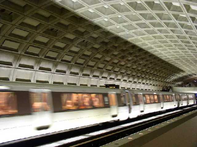
Interesting concept. Interesting photo in itself (plenty to look at) Perhaps more cropping on the right to remove the bridge thing could bring more attention to the train.
It looks a little pixelated [sp?], but I'm not sure what kind of camera you use. It's a great image. I like how there is no color but only the light & people in the train. Good luck.
Composition is good, although I might like to see the train a little higher in the frame. I like the lines in the ceiling. Quality is lacking however - try to save at a higher file size to avoid the jpeg artifacts.
I know I've seen this before, you entered a photo of the same location in the "Secondary Colors", right? And, you won the blue ribbon. That's no fair! Now you might win a second ribbon with the same idea :) Possibly, cause this is a good shot. My only problem with this shot is that it appears a little oversharpened. Please reply so I know if my impression is accurate! Did you sharpen this photo more than a little?






 Add photograph to your favorites
 Add photographer to your favorites


