|
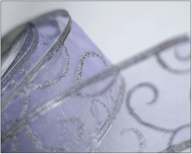
I think that cropping off a bit at the bottom, making the aspect ratio maybe 1.2:1 or 1.4:1, would tighten up this image and keep the viewer's attention on the left somewhat better. including the far edge of the ribbon in the lower right is an invitation for the eye to wander, because it's such an isolated shape, and that takes the viewer straight away from the upper left, where all the visual interest is. I think this is a really good image - the unusual palette of greys and lavenders is soothing - but the presentation is a bit off. presentation is essential! (6) |





 Add photograph to your favorites
 Add photographer to your favorites


 Photographer found comment helpful.

