Challenge:City Life (Classic Editing) Camera:Nikon D1 Location: San Francisco Date: Jun 20, 2002 Aperture: 2 ISO: 400 Shutter: 1/5 Date Uploaded: Jun 23, 2002
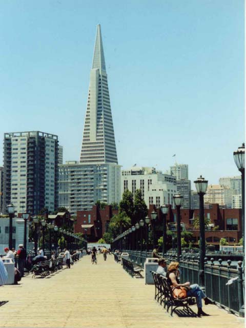
Picture taken in San Francisco, CA near Fisherman's Warf. The trianglar building is one of my favorite buildings in this city because of how unique the design is. Buildings also can be works of art, which San Francisco is full of!
Statistics
Place: 73 out of 112 Avg (all users): 5.0214 Avg (commenters): 6.0000 Avg (participants): 5.0421 Avg (non-participants): 5.0072 Views since voting: 1479 Votes: 234 Comments: 33 Favorites: 0
Thanks for all the comments! Sorry about the poor quality that many have noted but being the first submission, I was trying to learn how all this works. It was much easier taking the photograph than getting Photoshop Elements and uploading it to this Web site! It took me forever to figure out how to get the right size, width, height, etc. I actually did crop the photo but I also see that I played with it too much (the extra border). Also I was pushed for time on Sunday night, I didn't take the care to make sure key elements were focused. I took the photo near Fisherman's Warf, but it's not Pier 39, a few piers before (sorry, I didn't pay attention to the number. I was all the way at the end of the pier when I did see how nicely lined up the posts were to the buildings, particularly the trianglar one. I was also wishing the Pier to be such a bit longer. Maybe I'll try again in a boat. Interestingly enough, there was another photographer there too but I was jealous of him because he had better equipment! Just to ease another question that alarmed me!, NO it's not an old postcard I scanned! I really did take this photograph!
Maybe it's just the digital nature of longer shots, but it doesn't seem that clear. I like the idea/framing, etc. The lamp posts make in interesting effect, but on the whole......Photo 8 City 9 total 8
I love the composition of this photo. It looks really blurry to me though and I would have cropped the person/bag/whatever out of the lower left side. This would be a winner without the blur...as is 7. Good job!
Nice composition. I like the way the eye is led around the picture. You have two basic light levels in this picture however which would have been hard to manage within the rules of this challange. You couldn't have lightened the background buildings much without blowing them out, but the darker colors of the brick building, trees, and lamp posts merge and the effect is to lessen the impact. You might have been able to open up the exposure a stop though, which might have pulled the line of lamp posts visually out from the trees.
I like the composition - the rows of lights leading up to the pointed building. Well done! The only con I see is that maybe the texture of the walkway could be a little more defined. Where in San Francisco is this? Beautiful place.
I think if the existing colors were a little brighter, this picture might have a little more *pop* I like the way the lightposts pull your eyes toward the center of the picture, and then the tallest building pulls your eyes up.
Very nice strong lines! a little fuzzy (Mono/tripod might have helped) The only other thing I would change is maybe waiting for a more interesting (ie. colorful) subject to wander into the center. The eye is drawn to the bike, but s/he is fuzzy far and dark.






 Add photograph to your favorites
 Add photographer to your favorites


