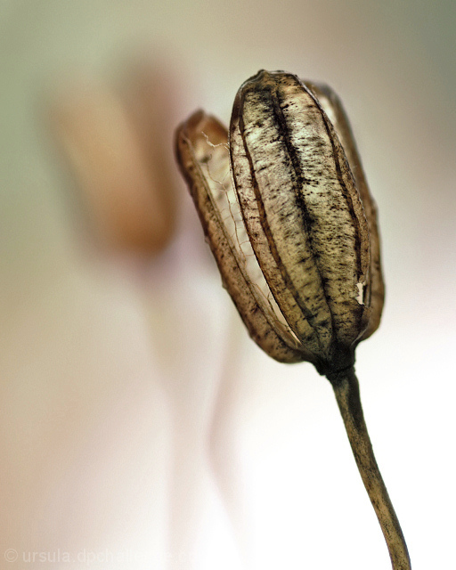
Opened original JPG in PSCS, cropped, adjusted levels and highlight/shadows. Resized, sharpened, and saved.
Opened in PSP9, adjusted curves and sharpened a bit more. Very carefully ran through PSP noise remover. Desaturated slightly (-18, all colours). Saved again.
Statistics
Place: 71 out of 346 Avg (all users): 5.8206 Avg (commenters): 6.7778 Avg (participants): 5.7500 Avg (non-participants): 5.8733 Views since voting: 1369 Views during voting: 354 Votes: 262 Comments: 10 Favorites: 3 (view)
7 - Nice, nice colors and 'feel'. Criticism; difficult, but maybe some more 'space' on the left, not sure. Detail is fairly good in the seedhead/pod, but would like to have seen a little more, if possible (difficult likely), perhaps a tighter cropping (quality dependent) not sure. Looks like this would be hard to adjust the contrast on, but the patterns and dark coloring are nice but again, just like to see more detail, especially in the 'fibres' and texture. Up to 7 from 6.
It's the lovely colour palette plus the textures that draw me to this image. I like the contrast between the harsh, brown colours of the foreground item and the softer pinkey browns of the background one. I also like that the background one is positioned to be like a surreal shadow to the foreground one. 8






 Add photograph to your favorites
 Add photographer to your favorites

 Photographer found comment helpful.


