*Critique Club*
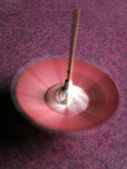
General: The spinning umbrella depicts motion very well. The shadows generated by the spinning add interest. Unfortunately the colour of the umbrella and the colour of the background are too close and actually clash a bit. Did you try this with different colour backgrounds? White posterboard might have worked very well.
Composition: Good choice in doing this in the portrait (vertical) format. A bit more room on the top and less on the bottom could probably work even better.
Exposure: Exposure seems to be correct. There are no blown out areas nor are there too many dark areas with no detail.
Impact: Some impact is achieved due to the spinning motion of the umbrella but as mentioned already the background detracts from this. A plain, light coloured background would probably add impact.
Good choice for the 'Speed' challenge. Keep shooting.
Colette |





 Add photograph to your favorites
 Add photographer to your favorites


 Photographer found comment helpful.
