Being raised in a small country town, I was driving down the road and thought, "You are too close when you can spread your arms and touch your neighbors house.
Statistics
Place: 13 out of 112 Avg (all users): 6.2188 Avg (commenters): 6.6552 Avg (participants): 6.1304 Avg (non-participants): 6.2803 Views since voting: 1860 Votes: 224 Comments: 32 Favorites: 0
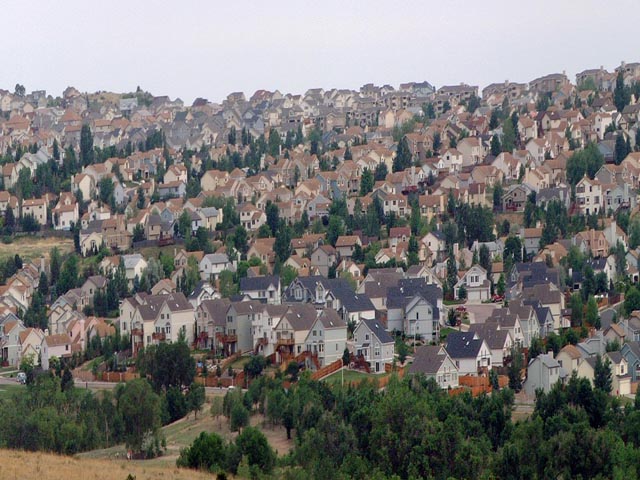
Now that the voting is over!!! The reason this picture is so dang hazy is because of all the smoke that was around Colorado Springs from the Hayman fire. IT was a very dark hazy day this day. Here is the link to the original picture. //www.pbase.com/rkymtndream/challenge_photos View it as the original photo. I just cropped a section out.
This is good - I would have liked a little more color in this (bluer sky, with less hayes) but the world isn't always perfect for us is it. - I gave this 8 - Gotcha
Seems there's a tilt problem... I would've zoomed in to exclude the trees and the sky... more houses closer together would seem like there's no relief in site. with the trees and the sky, there's an escape.
Wow, I can see my house :? ) Nice composition but I think I would increase the contrast a little more and maybe cropped a little tighter so the tops of the houses are closer to the top edge increasing the 'crowded' feel.
ech, what a mess (the subject, not the photo). although...hm. I don't know, the houses, their roofs, my eye wants to blend them all together, into a smear of colors, so maybe blurring this more would look interesting. nice framing.
There seems to be a hazy sky in so many photos this week - in this case I think it adds to the overall tone of the photo. I also like that the focus seems to slip in the top part of the picture making all the houses seem to start blending together.
Wow.. this is a 'crunched' neighborhood :) I'm not sure if your camera allows the use of filters or not, but this is a perfect example of where a graduated neutral density filter would make an improvement. The upper portions of this image look a little over exposed while the lower third looks fine :) - good shot! = 7 - jmsetzler
Has this been distorted? Either way, I like it - great title. I wonder what it would look like if it was cropped so that only the houses were in the photo? Well done
This picture looks very flat to me because the sky is dull (not your fault I know) but I think some thing in the foreground would help to give this shot some depth.
Your title says it all. One suggestion might be to crop it so that there is no sky at the top and no field in the foreground. You would lose some of your composition quality (which I think is good), but it would give it an even tighter feeling.
WOW ! The title is perfect ! I would like this better with the trees in front cropped out. Maybe just a little levels to brighten the color. This is city life for sure !






 Add photograph to your favorites
 Add photographer to your favorites


