*phew*
really though - it is an honor that i thought that might be the case - because it really does look like one of those old moodly adverts from the 50's. Or a film noir feeling to it (which a lot of your images have). I am really surprised this didnt do better - it was my favourite!
i hope you mean to say it was in the style of a circa 55 mag cover and not a real magazine cover?
I really loved this, but i am kind of worried now...
Yes Elli..."in the style of"...how silly of me, I must remember my semantics here at DPC...but no need to worry...this is very much my image and I do have the proof to back that up.
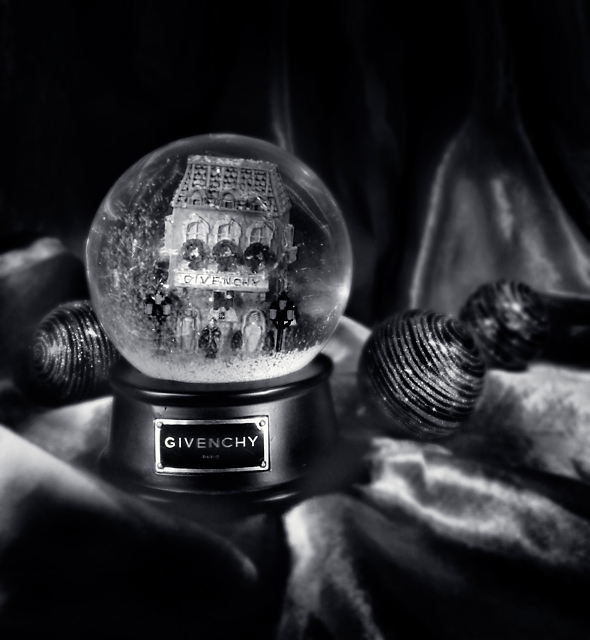
I bet you've had some comments about the B&W, because "it's not that festive in B&W" (I know, because they say it to me too.. ;))
Even though the focus seems to be a bit off, I keep coming back to your photo. I like the tones & composition, your photo feels a bit like a magic one to me.
One of my faves!
As it appeared I felt like I needed colour.
But after looking at it for awhile the light you have given life to this shot with makes it pretty special, and of course focus and composition. Very creative
Love that you made it b/w, i doubt I would have liked it as much in colour. Love the b/w conversion too, great contrast and good lighting. 8 from me, one of the best in the challenge.
I studied this photo for over 5 minute last night. I like aspects of it, but others I don't. I can't put my finger on it. I love the way that the balls lead your eye back to different areas of the shot. I like the snow globes slightly off kilter building inside. But I think I miss the color, yet it's the black and white that interests me. See? You're making me crazy! LOL The blur of the cover right in the forground kind of distracts me. Maybe that's it. The lighting is really good. Hmmmm - well for anybody that gets me to think THAT hard and say THAT much at least deserves a 7.





 Add photograph to your favorites
 Add photographer to your favorites

 Photographer found comment helpful.


