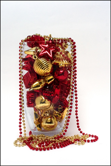
* Conversion from RAW: Enhance shadows, change white balance to flash
* Crop
* Levels
* A little saturation
* Remove line between two pieces of paper used as background
* Burn to enhance colour of vase and to tone down some highlights
* Dodge some of the darker areas
Statistics
Place: 29 out of 120 Avg (all users): 5.8681 Avg (commenters): 7.8750 Avg (participants): 5.6190 Avg (non-participants): 6.0000 Views since voting: 989 Views during voting: 315 Votes: 182 Comments: 9 Favorites: 0
I like the slightly off-center composition. Good lighting and color as well. I could see this as a holiday catalog image (though maybe not the cover) - there's adequate space on top to put some text in as well (for use in a magazine that is).
I can see this on the cover with Holiday 2005 in the negative space area at the top and bottom. I love the gold and red against the white. Beautiful detail. Nicely done.





 Add photograph to your favorites
 Add photographer to your favorites


 Photographer found comment helpful.


