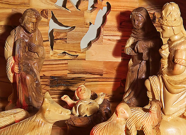
If possible, I'd bounce the flash here or use a slow shutter speed on a tripod to eliminate the shadows. A different crop might work well too, maybe showing more of the manger scene.
This is a nice subject and you got in nice and close. The lighting leaves something to be desired----the shadows behind the figures are harsh and distracting. Also, the grey background behind the cut-out angel just looks plain bad. It is very drab and there are the shadows that really stand out. Using a black background and positioning the creche further away from it would have provided a sense of space surrounding the creche. As it is it looks quite a bit cramped.
Nice composition but the lighting is a bit harsh for my taste, too many glaring headlights and strong shadows and it just doesn´t seem fitting for this shot to me.






 Add photograph to your favorites
 Add photographer to your favorites


 Photographer found comment helpful.


