Challenge:The Letter B (Classic Editing) Camera:Sony DSC-F717 Location: Victoria BC Date: Jun 28, 2003 Aperture: F/5.6 ISO: 100 Shutter: 1/125th Date Uploaded: Jun 28, 2003
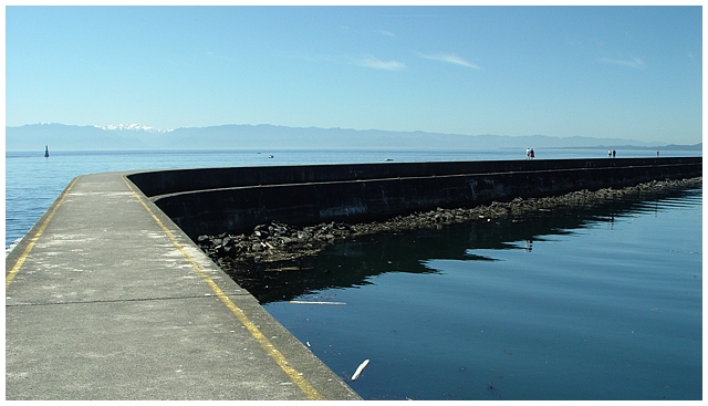
As I mentioned during the challenge, I really like the composition of this shot. It very strong catches the eyes and then leads them through the frame. I guess, technically, "leading lines" are supposed to lead "somewhere," but I like it when they just lead me out of the frame -- kinda like a joke on the viewer almost. I also like the way the shadows provides a dark "line" through the frame breaking of the blue tones.
Technically, the focus, lighting, etc is good. Don't know that I can comment on that a lot. I guess what may have been a "downer" for some people is that, while it is technically a good shot, and compositionally interesting (at least for me), it lacks that certain element that gives it a "personality" to the general population. Though this structure may mean a lot to you, it just doesn't convey that emotion to the average person and pull them in. Perhaps if you had put someone or something in the foreground (a sad woman, a man sitting thoughtfully) in the foreground so that it had a more emotional subject, more people would have been intrigued by this shot.
If you have questions, or comments, please feel free to PM me.
Best to you in future challenges.
Hey! You are the proud recepient of my "you got screwed" after-challenge comment. This fine award goes to the lowest scoring image that I gave an 8 or higher in the competition. Keep up the good work and don't let your score get you down. Your black and white spot edited version was awesome by the way, I would have given it a 10.






 Add photograph to your favorites
 Add photographer to your favorites

 Photographer found comment helpful.


