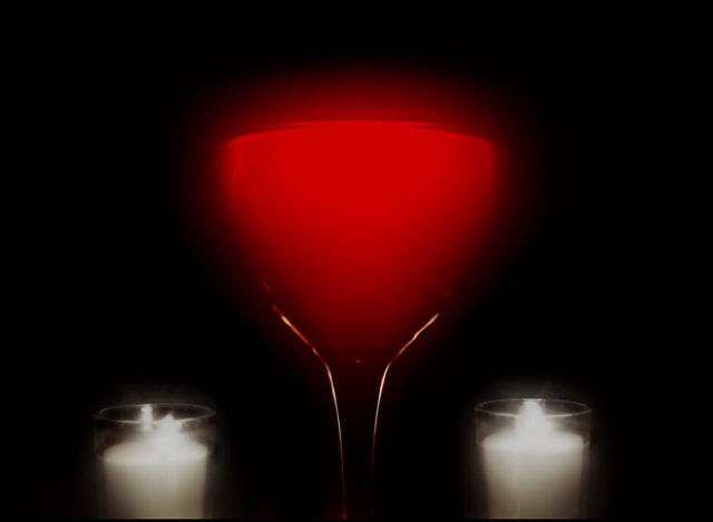
The glow of the glass is very nice - however the white ones are too blurry and distract from the effect in the glass. I would have scotred this image higher withough that addition.
I like the blur/halo around the wine glass, it gives it an added dimension. I don't like the blur around the candles though, it just doesn't appeal to may taste.
this is nice and graphic..the red white and black. u know your color sceams alright...
this is my highest voted so far and i think the only thing wrong to my eye is -the wine glass sits slightly to the viewers right and this wouldn't matter much but the candles are there as a judging point
Nice red hues in the wine, and I like the rim lighting on the glass. The almost-but-not-quite symmetry is a little distracting--aesthetically I'd prefer either a more accurate symmetry, or a more obviously asymetric composition.





 Add photograph to your favorites
 Add photographer to your favorites


 Photographer found comment helpful.


