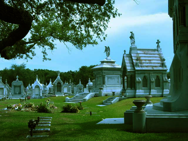
It looks like you're trying to create a "gloom and doom" effect by darkening your pic. Unfortunetly, it doesn't look scary. I think you need to balance it out with some light and lots of contrast which will create a better effect.
Initaly I rated this low, but when I came back to comment I considered artistic license should be applied. 'City Life' eventualy does end up here therfore with the strech applied it does address this weeks challenge. It is a good photograph though a bit too cold and morbid for my tasts it does deserve to be rated in my top ten.
Very blue (on a couple of levels), seems overly dark, but the sky is a beautiful blue. A bit unexpected for a "city life" shot, but an interesting thought/contradition. Tone down the blue (IMO) and you have a near winning shot. Photo 7 City 6 total 7
This could of been a winner but IMHO there is too much of a blue tint on the tombs. They needed to be whiter and the contrast is a little too much. Great shot tho and nice to see some1 taking a different angle to the challenge "8" Dogman.
I really like the composition on this photo but I believe it's a bit underexposed. Based on the shadows in this photo, it appears that the sun is high in the sky and i'm wondering if this was toned down with software. It's hard to tell :) I think the photo is good but I would have rather seen a stronger interpretation of city life :) = 6 - jmsetzler
The color seems to be a bit blue on my monitor. I think compositionally it would have been better to try to focus on a few less of the tombs...but then you probably would have risked people not calling it 'city' enough. The tree makes a nice frame, but that black loop on the side is sort of distracting...can't tell if it's part of the tree or some sort of statuary.
This image appears to have a very distinct cyan colour cast to it. Removing the colour cast and increasing the contrast would have improved the overall quality of this image. Also found this image to be a bit too busy.





 Add photograph to your favorites
 Add photographer to your favorites


