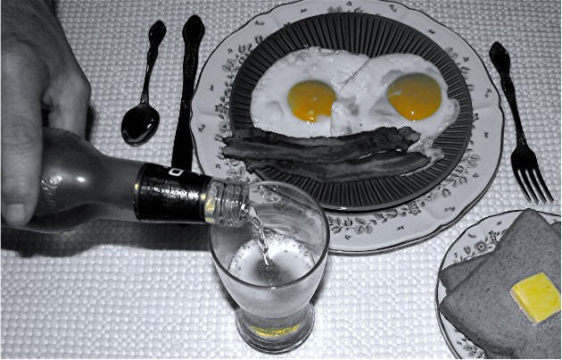
I know advance editting isn't allowed, but this shot would have turned out a lot better if just the beer had colour while the rest was desaturated. It's definitely a good effort. I like it although I think you might have over saturated yellow a bit too much. It's that or when you desaturated the yellow the egg yolks doesn't look so great. I gave 6 on this.
Hah. I like. I like the play on color. I think the butter's color is a bit too intense. Tone down the eggs and butter and brighten up the beer color, perhaps. I like the composition overall. Not sure if I like the 1/2 of a hand, though. Nice job.
I don't think I would have chosen this coloring for the picture. I can see the benefits of using the yellow to highlight the beer, however bringing out the eggs and butter made them both look unappetizing. Perhaps a slightly different angle to capture more of the beer could have worked? I do like the neat and simple arrangement of this shot, and I like the way you've interpreted the challenge theme.
Nothing better than beer for breakfast . That's what I've always said. :-) I think I would have preferred this shot with a beer can or bottle sitting with the breakfast food, rather than being poured, as this just throws the composition way out of wack.





 Add photograph to your favorites
 Add photographer to your favorites


 Photographer found comment helpful.


