Greetings from the Critique Club Jbaram!
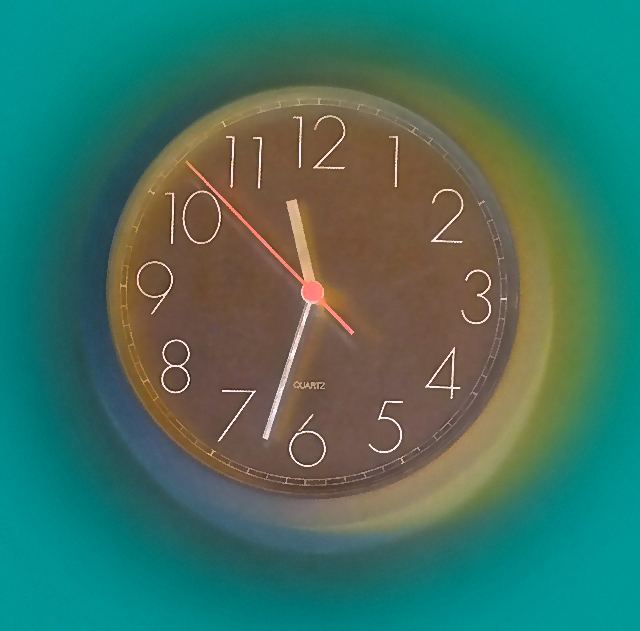
Interesting effect, but I’m not a fan of the photo. The plain clock, even with the effect, just doesn’t work for me. Maybe a slower shutter to show motion blur on the second hand so it looks like it’s moving towards lunch time?
Color wise it’s much too contrasty for me. The pink second hand seems to be fighting for attention with the deep greenish background and it’s just too much conflict. Also, the green is just too dark and dull, maybe it would look better black and white?
Overall I probably would have scored this a 3. It meets the challenge and the effect is interesting, but there is nothing in the photo that interests me and the colors over power it. But hey, at least it wasn’t DQ’d! :)
I hope you find my review helpful, if you have any questions feel free to PM me.
|






 Add photograph to your favorites
 Add photographer to your favorites


