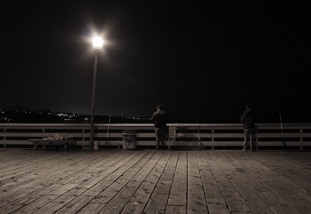
Whilst there's an awful lot to like about this - and like it i do, certainly, one of the best I've seen in this challenge - I can't help feeling that the framing and the crop are a touch arbitrary. Is so much gained from the inclusion of the boardwalk that you mightn't have placed the fishermen and the rail more orthodoxly within frame? You'd have saved some of teh distortion of the angle of the lamppost, and wouldn't have lost the boards completely, and i think the shot would have been more about the fishermen than this slightly strange composition which appears to be about the boards as much as the people - it almost feels wilfully an odd composition, and I think the image would be strong enough not to need that.
Really like the detail being picked up in the planking. Would have liked to have seen this shot a bit closer without the light glaring at viewers eyes. It is a major eye distracter and may cost you points.
I like the feel of this image and it is nice and sharp...but the composition just isn't working for me. Probably wold have been good to have been zoomed in more on the fishermen. I would say that the main thing that need to be eliminated from the shot is the light post....it is the brightest thing in the shot and distracts from some of the more important elements.







 Add photograph to your favorites
 Add photographer to your favorites


 Photographer found comment helpful.


