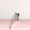
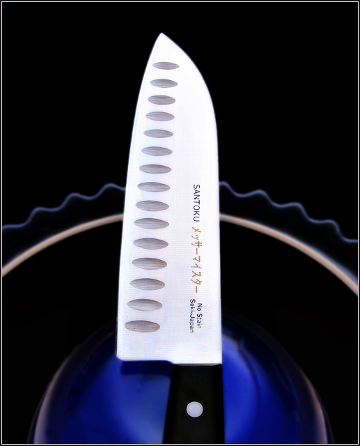
Robert, I can't figure out why, but the knife just doesn't look sharp to me. The edges appear soft. I can tell it's in focus because the "Santoku" is sharp.
A "glow layer" has been applied to everything but the kinfe, and the interaction between glow and not-glow is a "soft" one.
Robert, I can't figure out why, but the knife just doesn't look sharp to me. The edges appear soft. I can tell it's in focus because the "Santoku" is sharp.
First I like the symmetry, love the colors. The blue showing as a blur on the right side just above the bowl should have been fixed. Overall I really like it, my only suggestion to make this really neat would be a less vertical to the knife, a lower camera perspective would be really cool.
First of all, the background: I like it a lot. The colour and the shape. The composition as a whole, I like too. Maybe too symmetric for some, but I think it works here (I guess you could say the knife is asymmetrical enough). Anyway, my problem is with the knife itself. The edges and the text are a little soft. Perhaps this was the effect you wanted, but I think in that case you'd be better off without the text. Text invites reading, and I find the text just a touch soft to be pleasing, or not soft enough to be interesting. The exposure of the blade seems a little off too. Again, it seems to be too 'middle ground'. There is a little colour/texture/detail to the surface, and I think it might have been better with all or nothing. In that sense, I think it is the slight colouring that bothers me the most, and it might be somewhat improved simply by desaturating the surface of the blade. Just some random thoughts...
The colors and use of the bowl are quite nice here. However, IMHO, the almost vertical knife, right down the middle, doesn't offer a dynamic image, nor does it work as well geometrically with the bowl. I can't say this for sure, but I actually think having the knife pointed down, towards the viewer, would be more dynamic, and might even trigger a very slight "danger" emotional reaction from the viewer. Another thought: It might have been interesting geometrically to have the knife just above the bowl, somewhat horizontal, touching it at the top of the arc just barely.
Just some thoughts, hard to visualize without cutting the knife out to play. The light and colors here are so wonderful though, that I'd love to see you play with this a little.
I gave it a 7. Personally, I think it would have looked just a touch cooler if you had cloned out the english words and just left the japanese characters...
I keep thinking I've seen this knife before. Hmmmm. But it didn't look quite like this. I guess many people have knives like this. It looks beautiful on the inverted bowl, and I like the frilly tart plate edge (is that what it is?) - makes it look like a sleeve or a skirt.
Out of curiosity (and you can answer after the challenge if you want, although I don't mind either way), why would you use the side with writing on it? Do both sides have writing?
Nice photo, and nice knife. Who is the maker? I have an Aritsugu Deba that I received as a wedding present. For the photo itself, I think I'd prefer to see the blade a bit less bright, so you could make out the markings of the steel. Also, a bit more DOF would be good - the bottom edge of the knife looks a bit OOF.





 Add photograph to your favorites
 Add photographer to your favorites


 Photographer found comment helpful.


