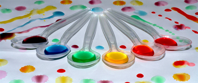
7 - Really like the use of (and choice in sequence of) colors here and surrounding 'arrangements'. Criticism; difficult, as the 'wide'/horizontal framing works well, obviously better 'wall size', but perhaps 'here', a little more height, possibly bottom or just top, or maybe even both, may have made this better in my opinion, not sure. The symmetry is slightly higher on the left, but that may also just be the angle.
I'm so happy to see the colors in the 'right' order. So often we see created 'rainbows' and they're all mixed up. Blame it on my OCD to like seeing these in order. The colors are great. Nice vivid and bright. Focus appears to be good as well. Wish we could have this bigger, but I realize the size limit restricts this, and the crop makes it just that much smaller. I think this would look great as a huge image hanging up somewhere.
Lighting is good, I don't see any distractions except the darkish dye to the left of the photo near the purple spoon. Otherwise, a fun image. ~Heather~







 Add photograph to your favorites
 Add photographer to your favorites


 Photographer found comment helpful.


