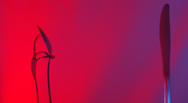
In case you don't get it... The fork and spoon are having an afair, while the knife looks on. :)
This shot was made using two studio strobes, one with a red gel (meant to illuminate the fork and spoon representing passion) and one with a blue gel, illuminating the knife (representing coldness) I was trying to get a lot more blue on the knife, but I don't have barn doors for my lights, so they were kinda spilling all over the place. I ended up using some cardboard to get the blue off of the fork and spoon. It didn't work out perfectly, but it's pretty close.
Only post processing was a little levels adjustment (the original was very slightly under exposed), a crop, and save for web.
Statistics
Place: 71 out of 163 Avg (all users): 5.4844 Avg (commenters): 6.5000 Avg (participants): 5.1829 Avg (non-participants): 5.7091 Views since voting: 889 Views during voting: 316 Votes: 192 Comments: 11 Favorites: 1 (view)
Hi, This is a very creative idea, and the fork, spooon and knife are well placed. The title explains whats going very well! :)
This might have placed higher with a lighting change. The silverware is sort of hidden by the colours of the background, if you had put a little light on the front of them all it might have brought them out a touch more. The red is harsh while the purple side is very calming. maybe also you should have switched the colour sides to give more emotion to the scene, with the knife sngery red and the couple soothing and passionate in the purple.






 Add photograph to your favorites
 Add photographer to your favorites

 Photographer found comment helpful.


