** Critique club **
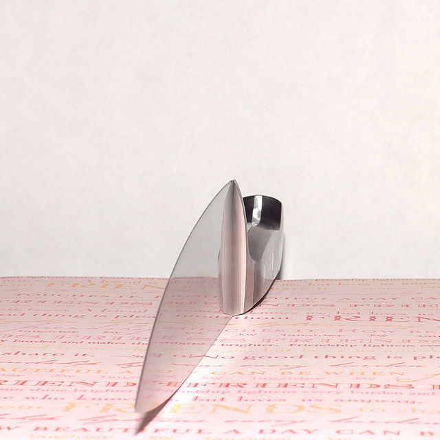
first impression: oh cool !! the knife almost looks transparent. Great angle selection.
A few things I think could be improved are; first the sharp reflected light from knife on the paper just on the right. If you used a more diffused light, this can be avoided and will help the knife look more transparent.
the background seems to have some red, a whiter background could add more ot the image.. a white paper used as background may provide you better results.
If you have any questions, feel free to pm me
-gaurawa
Very good clarity and lighting on this shot! I think I would like to see a different color (other than white) for the wall behind the knife. I think either a yellow or red would help bring out the print in the paper that's so well reflected in the knife.
I like this composition. The large field of white, the smaller field of paper, interrupted by the interestingly placed knife. (My wife just glanced over my shoulder, looking at your photo, and she said "Oooh! Cool!")





 Add photograph to your favorites
 Add photographer to your favorites

 Photographer found comment helpful.


