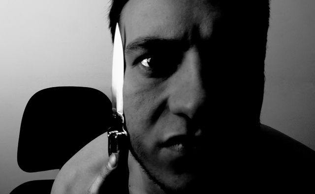
This is a creative idea. The model's expression is good, and using a single light source was, I think, the right choice for this. But the light background ruins the low key effect. The knife lacks detail; it's just a bright shape with no form or texture. I also think a vertical format would have been more appropriate for the subject. The face is somewhat blurry, and that's an interesting choice. I suspect having a sharply focused face with a little more contrast would have worked better, but it's really hard to say; it would make the photo more attractive, but that's not the goal here.
This photo leads me to believe some serious photographic training is needed along with some sociopathic/anger management treatment. Because young children are members at this site I would expect a more mature imaginative entry. Perhaps browse the archive and see just what form/style of photography wins ribbons.






 Add photograph to your favorites
 Add photographer to your favorites

 Photographer found comment helpful.


