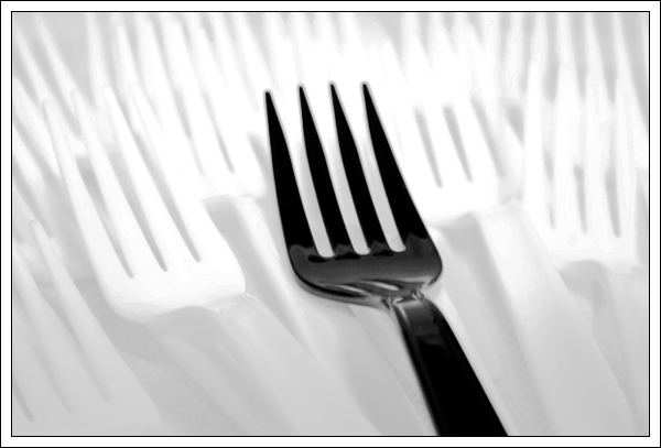
Excellent idea and composition. I wish the DOF wasn't quite so shallow so the tines of the black fork were in sharp focus. Good lighting to wash out most of the white forks and keep them from competing too much with the subject.
punny titles are always good, and this one is clever :) I like this picture and the b/w contrast - though I think a bit closer adherence to the rule of thirds might work a bit better. I feel like there's a bit too much space on the right and not quite enough on the left.






 Add photograph to your favorites
 Add photographer to your favorites


 Photographer found comment helpful.


