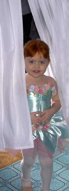
A beautiful llittle girl. It doesn't really capture the mood of 'too early' for me, because I can see she really isn't backstage (the kitchen tiles give it away). This is very severe cropping that doesn't do anything to enahance the composition. Some basic advice, compose your image carefully either in the viewfinder or on the LCD monitor before you take the shot and you can avoid this sort of weird post-editing crop (it takes a bit of practice with seeing how the camera sees,i.e., it sees everything that your mind's eye is able to ignore). Also, when photographing children (and pets), as a rule, you should compose the image from the child's point of view (which usually means squatting or even laying on the floor). There are expections to this rule, of course, but you should try not to make them too often. Lastly, flash really hurts this shot. Her dress as way too much glare and her eyes look washed out. The shiny dress and the bright blue patterned floor have become the main focus and that's a shame because she is such a beautiful little girl. She has such gorgeous coloring there is great potential for some beautiful portraits. It is worth buying a good book about photographing children. My suggestions for starters is use window light as available light to avoid using flash. Also, take some photos outside, in a shady spot if the lighting is harsh and full of contrasty shadows (have the sun behind your subject so she isn't squinting and then make sure you up your exupposure compesation
4 - One of the few who 'Met the Challenge' (my interpretation at least) quite well, it was not easy. Criticism; difficult, especially given the nature of the Challenge, but this still looks 'too snapshottish' in my opinion. The flooring clashes with the dress/outfit color, etc. Maybe a different crop may have made this better (especially at the top), not sure. Difficult to correct in basic editing, but seems some slight 'red eye' too, but could just be reflection, hard to discern at this size.
i see you have cropped this quite tightly in the vertical, which is good. You have sliced off the foot too though which isn't so good ;-)
The whole image feels a little washed out and perhaps needs a contrast boost.
Oh she's so adorable! I'm sorry I gave a 3 though. I'll explain why. The picture is a better grainy and quite our of focus. There's a bit of the red eye effect as well. The title doesn't work for the shot as well. To me the title says the mum went in to take the shot, but it looks more like the little girl came out to show mum. There is too much shine on her dress as well.
My mum loves the shot of this girl though. Great effort.







 Add photograph to your favorites
 Add photographer to your favorites


 Photographer found comment helpful.


