You are a member - I'd be interested in seeing this at 640 width (if possible) posted in your portfolio. I like the colors and think it has potential bigger. edit: thank you for posting the other version, I left a comment
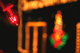
Oh, size... but you know that by now. The lightbulb in teh top left corner is in focus, but it hardly occupies enough of the image to complement the huge area of OOF lights. The idea for the study is good, and I am not scoring this low just because it is blurry - rather because it failed to use the blur in a eye-pleasing manner (at least in my opinion).
Use the maximum size available, your photo will fare much better. To me, even though the one lightblub is sharp, the out of focus background dominates, with the lines being in contrast to what I imagine from Xmas decoration. The multi-color item is nice. Overall, I think I, as the user, am confused what the subject of the image is.
There are several things that will get this one low votes. It is out of focus, you can't tell what it is, and it is a little too small. Its a good idea to stay close to the 640 diminsion limits.
2 - This looks like it has good potential at 'full size', but; Criticism; needs to be 'full size', 640 width in this case. Nice colors and bokeh effect, what I can discern.






 Add photograph to your favorites
 Add photographer to your favorites

 Photographer found comment helpful.


