Had absolutely no ideas or shots during the month I thought would fare even half way decently. Was messing around with the new lense, took this shot for another competition at the Museum the first week in December. With nothing else at hand that has not already been seen, this is it.
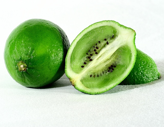
Cut the lime in half, cut out some of the pulp to allow the kiwi to fit in. Peeled and sliced the kiwi the long way, fit the slice over the lime, cut out the shape, pressed it in.
Post processing:
levels
cloned edges of kiwi to make 'better' fit
airbrushed out light reflections
resize
sharpen
save for web
I am sure this will be at the bottom of the heap somewhere, but I like it.
Statistics
Place: 119 out of 519 Avg (all users): 5.9965 Avg (commenters): 7.2143 Avg (participants): 5.8230 Avg (non-participants): 6.4500 Views since voting: 1705 Views during voting: 477 Votes: 289 Comments: 19 Favorites: 6 (view)
Wow. This is excellent. I browsed through this challenge, but didn't vote. This definitely underrated. Must be due to the large number of excellent shots. In a regular challenge, it would have been at the top (IMHO).
Although the concept isn't unique, the execution is great. I spent a lot of time marveling at how well the kiwi was cut to fit, and how it wasn't mushed up. Nice, crisp focus and great colors.
I really liked this, didn't comment--the texture of the surface paper is a little distracting in the foreground, maybe it's a cropping thing, otherwise very appealing and I'd given it a 7.
8 - Good execution. Good color & color matching. Criticism; the 'paper'(?) base 'works' but doesn't add to the feel in this shot in my opinion. Perhaps if the focus were not so sharp on it (especially under the limiwi), might have made this even better, or perhaps an 'even distribution', it just is noticeable on that side. Overall a fraction 'sterile' feeling, perhaps a slightly different placement (more fore) of the limiwi, giving a little more 'depth', may have also given this extra. Would like to see similiar texture on that left lime, as is on the slightly out of focus one on the right. Perhaps the 'space' top/bottom shifted so it wasn't so centered, not sure.





 Add photograph to your favorites
 Add photographer to your favorites

 Photographer found comment helpful.


