Congratulations on your first entry and welcome to DPC! Be careful, it can become addicting!
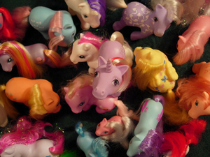
I really like the composition of this shot. I love that you placed the central pony on top of the others, making it stand out even more. There's a lot of talk about rule of thirds, but I think putting something in the dead center of a photo can often be just as interesting, and this photo proves that point.
As you heard from many other commenters, this photo is just way too small. I feel that whenever someone has a small photo, they're usually trying to hide something, such as poor focus or dust on the lens. The larger a photo is, the more confidence it seems to have, so don't be afraid to really utilize the maximum size allowed.
I love the colors in this photo, they make the whole frame very interesting to look at. Unfortunately, there seems to be a yellowish color cast caused from the tungsten lighting in your living room. Most cameras have a feature that can get rid of this, and Photoshop can also fix it. This, along with a slight increase in saturation and contrast, would have really made the colors jump out of the photo more.
I also really like the dark spots between the dolls. I'm not sure if this is a result of lighting or if they're sitting on a dark surface, but I think the deep shadows really make the photo more interesting and give it depth.
aww I love this image! Colorful and clear - great focus and composition. and it brings back My Little Pony memories when I was a kid. :) the only problem is that it's a little too small.
4 - Mainly for the potential. Colors are good and (from what I can discern) the focus & focal point is good too. Criticism; the size of this is the biggest negative. Needs to be 640 on either width or height, in this case width. I like the way you have set the middle unicorn facing up to the camera. A slightly different crop (carefully choosing what to 'cut out'), and the size, would have made this much better in my opinion.







 Add photograph to your favorites
 Add photographer to your favorites

 Photographer found comment helpful.


