|
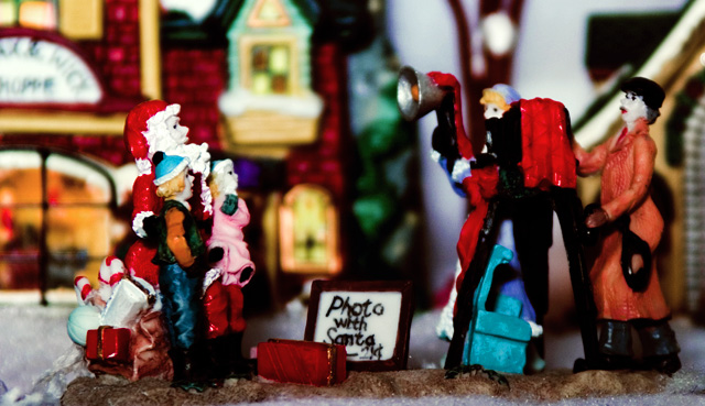
5 - Like the potential. Criticism; assuming this is (or needed to be) a macro, the focus seems 'off'. Like the colors, but perhaps adding more space between the feature and the backbround, may have given a bit more 'depth' to this shot. Possibly even a slightly different angle/perspective too (more side on?, not sure), and a crop/nudge rotation up on the left - to level the base, may have made this better in my opinion. |






 Add photograph to your favorites
 Add photographer to your favorites


 Photographer found comment helpful.


