I have studied your image and have the following to offer:
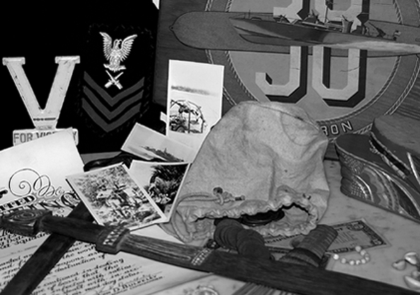
Composition/perspective – At first look, the image appears to be out of focus. Looking deeper I see that it is more of a DoF situation. The plane of focus appears to be the very back of the image. This leaves the foreground to stand on its own. This may have hurt the image some. Being a little busy in the foreground does not translate well with it being slightly out of focus. It makes it look busy and somewhat separate as opposed to part of the composition as a whole. The uniform being partial is ok, but the sign becomes a bit of a distraction being cut off. It may have helped to adjust your object placement/distance to subject to show the whole numbers at least. There is also a small white patch between the sigh and uniform that could have been removed or objects adjusted to hide it. The only other objects I find distracting are the objects next to the bag at the bottom of the sign. Not sure what they are, but they lack any real definition or indication of what they are which makes them appear as though they do not belong in the scene.
Color – b/w, the conversion overall seems to have been done fairly well. There is a little imbalance between some of the black areas – the uniform appears very black while some of the black/darker objects in the foreground appear to be starting the shift to grays. The whites in some areas appear a little bright, but not overly so.
Lighting – this looks like a flash shot or at minimum a single light source. This is one of the strongest elements of the shot. The scene is evenly lit and nothing is obscured by dark shadows and there are no bright spots/glares. Well done!
Challenge requirements – there is no doubt this meets the requirements. A unique choice of collections to portray.
Overall/my opinion – in my opinion this could have been a much stronger entry if the focus/DoF was adjusted a bit. I think this may have played a role in the voters acceptance of the shot. The collection itself works off a strong topic and the image would have contained a much stronger emotive force.
what an interesting subject for this challenge! i wish that the focus were sharper on the displayed pictures and sword, so that the viewer could really get a feel for what those spoils are.
From reading the title, I expected to 'feel' more from this photo. I had to look too hard to identify everything. Perhaps not cropping so much off the outside of the photo or maybe leaving the photo a color shot? Looks like an interesting collection.
3 - Like the potential. Criticism; more attention to the composition/placements and also cropping, if possible would have made this better in my opinion. Too much seems either out of focus or blurry. Not sure on the toning, works, but perhaps needs some tweaking.







 Add photograph to your favorites
 Add photographer to your favorites

 Photographer found comment helpful.


