Author Thread
Post actions
weak, should have done better! I like it, so thats good. :P
Post actions
oh...my....god....
Post actions
This is tooooo cool! You got ripped!! Should have scored at least a 14. (well, highter than what you got anyway!)
Post actions
great concept, love the shirt. the brightness should be higher with a bit more contrast... looks a bit underexposed. but you're on the right track.
Comments Made During the Challenge
Post actions
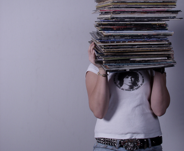
nicely composed, like the use of negative space. the lighting gives it a "screen door "feeling, though, and i find myself wishing that the shot were crisper/brighter. like the jim morrison shirt! a cool composition and great idea for this challenge!
Post actions
Excellent shot I love your placement and overall choice.
Post actions
Musceles don't seem to be bulging yet.............LOL
Post actions
Great shot. Some fill light to reduct the arm shadow would make it even better.
Post actions
Kinda cool, kinda retro. I guess I like it.
Post actions
Post actions
Colours seem pale, but the composition is nice.
Post actions
I think the fact that cut of the model's head off is interesting and somewhat different. I like.
Post actions
Uhhhh Doors! You're just as bad as that Pink Floyd one I saw! Why can't anyone ever listen to less boring classic rock. That aside Im only going to dock you a few points because your photo is technically not bad, but dont think you got away from my unjust bias!
Post actions
Nice idea, but it's too dull and dark. A little contast and brightness would have helped.
Post actions
Post actions
Post actions
I like it. It looks like an album cover. I think it could use more contrast and less gray, but overall it's good - 6
Post actions
self portarait?? nice idea.
Post actions
Nice shot, a bit too cool and a bit desautrated.
Post actions
would be better with a little more contrast...
Post actions
Post actions
Great composition! I love the creativity of how you have displayed your collection. It's an interesting, appealing photo!
Post actions
Better background would make a difference...7
Post actions
Post actions
A little dark and needs some contrast adj I think, but good comp and nicely done. Good luck - hope you break on through to the other side ;-)
Post actions
Oh I love this. Between Jim Morrison on the shirt and the nostalgia of records. Nice use of negative space. THe overall tone even has a 60's sense to it - kinda blue! 8





 Add photograph to your favorites
 Add photographer to your favorites

 Photographer found comment helpful.


