Author Thread Comments Made During the Challenge
Post actions
A very simple but weel executed image... Well done... :)
Post actions
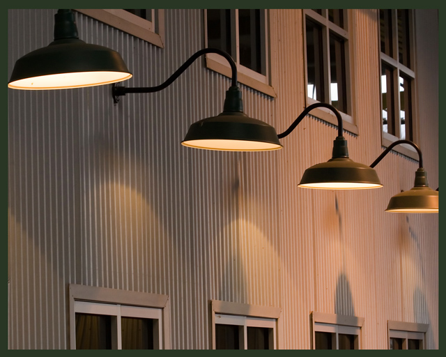
In regards to the light on the far right...why is part of it cropped out? I think it would have been a better pic if it wasn't.
Post actions
This is nice work. I wonder if you tried rotating either to correct for the siding being slightly off vertical or goinf the other way and pushing it more toward a 45? As it is now it seems a little conflicted. Still a very nice shot.
Post actions
Very nice. Good focus and composition. Perfect title.
Post actions
I think this picture is very classy, but it looks better without the lower windows
Post actions
I really wish the lamp on the right were not cut off.
Post actions
Damn...I wish the last lamp wasn't cropped :/ 7
Post actions
I like the leading line. Great symmetry. This would look cool in sepia or black and white as well, for a fun variation. 7
Post actions
i'll go with that! good photo




 Add photograph to your favorites
 Add photographer to your favorites


 Photographer found comment helpful.


