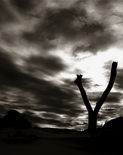
This is a really good photo. The composition is brilliant. The main focal point is off in the distance where the perspective leads, and it's positioned perfectly for proper balance. The bright spot in the sky is a secondary focal point, attracting attention because of its lightness, but not so light that it is overpowering. The silhouetted fence post is an essential element, both adding interest and helping to connect the two focal points, but doesn't really draw attention to itself. The effect works very well.
This isn't a photo that shouts "look at me" to everyone who glances at it (which explains the mediocre score in the challenge), but it doesn't have to be. It certainly richly rewards anyone who takes the time to get to really look at it.
Probably not what most people thought of, and hopefully you're not getting the "doesn't meet challenge" comment, but this is one of my favorites. I love the moodiness, and the contrast in this. Just awesome. Good luck!
7 - Like the effect and the toning and 'feel'. Criticism; minor but don't think your title 'adds to this effect' as much as another, possibly more 'simple' one may have. Likely difficult, but if that 'fork' was more dominant and dramatized more, may have made this even better in my opinion. Perhaps a slightly different/sharper angle too, not sure.






 Add photograph to your favorites
 Add photographer to your favorites

 Photographer found comment helpful.


