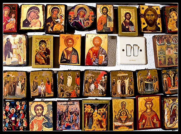
I took this shot in my father's room. He has a very big collection of byzantine icons. The walls are full of icons...
------------------------------------------
Post-production:
Adobe Camera RAW + Swadows/Highlights (+5/+5) + Brightness/Contrast (+10/+12) + Hue/Saturation (-3/+10) + USM (125/0,5/0) + Crop + Canvas size (borders) + Save for web
Statistics
Place: 75 out of 210 Avg (all users): 5.3127 Avg (commenters): 6.6250 Avg (participants): 5.0581 Avg (non-participants): 5.4286 Views since voting: 1186 Views during voting: 383 Votes: 275 Comments: 10 Favorites: 0
My first impression is that the lighting is harsh for the image. As other voters noted, the shadows detract from those amazing icons. I think that using a scrim would help reduce shadows, soften the lighting for the shot, deepen the darker tones and give an amazing glow/sheen to all the gold on the icons.
In terms of composition, the light switch is in a great place, hitting both a line for the rule of thirds and a golden mean point. The shape of the light switch is a good repeat for the shapes of the icons, and works well being included in the image. It also plays nicely off the title. Because there is so much amazing detail to be discovered in those icons, I would be curious to see how a tighter composition (as a portrait instead of landscape format) would have turned out. Additionally, the image could have been presented closer to the 640 pixel limit to allow for a better view of the detail(although I note that you're close to 149K as it is, so that may not have been possible).
In terms of focus, it may be due to the lighting but I feel like the entire image could benefit from being in sharper focus. In looking at the entire image as a whole, the focus point seems to have been the icon to the upper right of the light switch. All other icons, as well as the light switch, appear to be a bit fuzzy. In post-processing you could apply an unsharp mask, but sometimes that leaves the image with a pixilated feel. That's one for you to decide...
In general, I found this photo to be one of the more creative ones for the "Collections" challenge. The concept and composition are very appealing, and I really feel that sharper focus and scrimmed lighting would have really propelled this image forward in the challenge.
If you have any questions/feedback about this critique, please feel free to send me a PM. Thanks for such a creative image, and keep shooting!
love this idea, but the light of faith appears to be a bit overexposed to my eye (particularly on the left side of the image). like how the light switch plays off of the title. looks like you have an amazing collection of icon images, too!






 Add photograph to your favorites
 Add photographer to your favorites


 Photographer found comment helpful.


