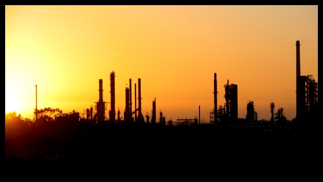
I really like the contrast between the deep orange and the silhouetted blacks. It is very pleasant to look at.
Compositionally, there is a little interest generated by the stacks but beyond that, there is little to hold the viewer's eyes for long. You have done well in having the sky occupy the top 2/3 of the frame and the refinery the lower 1/3. This helps it to feel balanced and "complete." As other commenters mentioned, perhaps composing the shot more to the right so that the tallest stack is on the right third would help. It would "anchor" the picture in that spot, and it would help to eliminate the bright spot of the sun, as it tends to dominate the picture and distract the viewer.
As far as camera settings, I am wondering if having a higher aperture number and a slower shutter speed would help the edges of the building appear sharper.
As far as dpc voters go, I suspect that many of them viewed this as a fairly good picture technically, but without that added *oomph* that drives pictures to the 6s and higher.
I didn't enter this challenge. But nice to see another Capetonian. I was going to also use the refinery, except at night when it was all lit up. Never got around to it.
Nice photo.
I like the sillhouetes.
Only critique is that there is too much 'space' on the left. I would have cropped more or panned to the right more.
6 - Nice. Criticism; sun is a little distracting (dominant) on the left. The silhouette effect is good. Perhaps a slightly tighter crop at the bottom, not sure, as does 'work' like it is. Those 12 extra pixels in width would have helped this. Color is nice. Not sure on the frame, perhaps just a fraction too thick, especially at this size, in my opinion.





 Add photograph to your favorites
 Add photographer to your favorites

 Photographer found comment helpful.


