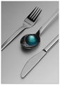
This is one of those instances I would recommend cropping away the table edge, even though it's in your original photo. It would place a little bit more emphasis on your objects, make for a more concise composition (with less colors and fewer objects) and besides, you can see the rest of the table's flat surface int he background.
Argh, no matter what the challenge is, there is always a flower pic! Only joking, this is a great idea and well executed too! I really like the background colour, although I wish it was more uniform at the top, and the negative space to cool too.
Strong colors and this gives it great impact, subject gives us a quirky abstract flower out of cutlery, well done. This image grows on me. I would have liked it better without the dark line at the base of image.






 Add photograph to your favorites
 Add photographer to your favorites


