Now here's a good reason for relaxing the spot-edit rules ... my camera is dirty and I can't spot-edit the dirt out ... so I had to use my old one for the shot. :(
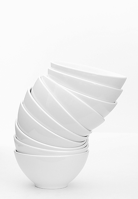
Overall, I'm quite happy how this turned out anyhow. If spot-editing was allowed, I probably would've tried to enhance the rim of the top bowl a tad more and gotten rid of the faint line where the two background papers meet. Nothing drastic.
What I did do: custom white balance, lots of overexposure (playing with manual setting because my camera only allows +2EV and that wasn't enough. Converted to grayscale, levels, contrast and brightness (much less than I have previously used for images, so I think here I finally got the exposure right), resize, USM.
Hope this comes out on people's computers, I submitted on Sunday so I couldn't check on the comp at work and I don't totally trust the one at home.
Not sure about the score I'll be getting, I think some people will score low due to "lack of interest". Others might like the simplicity of it all. I know I do.
Statistics
Place: 11 out of 151 Avg (all users): 6.5769 Avg (commenters): 8.1667 Avg (participants): 6.6742 Avg (non-participants): 6.3659 Views since voting: 2180 Votes: 130 Comments: 29 Favorites: 4 (view)
WOW! 2 weeks in a row that I get to critique some of my fav shots!!! :o)
LIGHTING: A beautiful high key shot without having the "blown out" effect that hurts the eyes. Not always easy to get.
FOCUS: Spot on....
COMPOSITION: The white on white is very pure and clean and works well here. The curves in the bowls makes all the difference in the pic. Your vertical cropping is good but the negative space above the bowls is distracting. I don't seems to find its purpose there. Maybe to show length?? As for the line in your BG.... didn't notice it so you did a good job. :o)
You're lucky to have 10 identical bowls!!! My dishes are all mismatched!! :oP
Thanks all for the wonderful comments, everyone. I was quite happy with the end result :) To those that suggested colored bowls and colorful backgrounds ... yes ... that would make a good photo, too, but it would totally be different from what I had in mind for this one ...
At first glance, to me it looked like a retractable lamp. This is an excellent use of white chiaroscurro to make the bowls' outlines suggest an entirely different "organism" . Would have given it a 9 if I had the chance to vote.
Finally, a *good* use of high-key! Man. I get kind of frustrated with people washing out their shots and trying to be stylish. This is a use I approve of, however. Makes a gorgeous abstract out of something that clearly fits the topic on first glance (title unneeded to explain). 10.
Very nice shot... the white on white is a nice effect, and leaving some space at the top (for me) lets you visualise the stacking of even more bowls on top. Would probably look good on a black or red background as well. Nicely executed, good job.
Simple and elegant. Fits the challenge nicely. And you've done very well to make all the edges of the bowl discernable against the background - which I can't imagine would have been a very easy shot to take
Nice job with the white on white. There are reflections on the bowls, but nothing major. I do see a corner about 1/3 the way up that you might be able to eliminate with levels adjustments. But this is a tough one to pull off and you did it well.
My favourite this challenge. A great high-key photo. I love the simplicity, the exposure is perfect. A great art pic out of the most ordinary and mundane items... 10







 Add photograph to your favorites
 Add photographer to your favorites

 Photographer found comment helpful.


