This time it's a mum that looks over edited. No offense, but whatever color you dropped saturation on to make the flower pop out from the backround was present in the center of the flower, which is the focus of the shot, so it makes it look a bit overworked in my opinion. I think it's cool that the petals look like paper though. Sorry, I'm not a big flower buff, I don't know all kinds of flowers from others. Just trying to be honest.
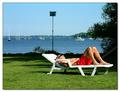
The color or tint just seems to be off here...too much green hue? I think toning down the brightness of the white and making some adjustments would help here. 4
This is very pretty, but the over all blue cast is unnatural. You can either set your white balance, in camera, or correct it with your editing software.






 Add photograph to your favorites
 Add photographer to your favorites


 Photographer found comment helpful.


