|
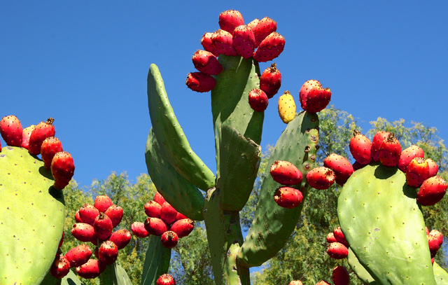
Good idea and nice subject. Focus and colors look good. Lighting seems just a little on the harsh side, perhaps a different time of day would be better? Overall, although a nice subject, it seems like there is just too much here, it's kind of busy, and a little aimless. I'm thinking maybe simplifying things a little and study some compositional rules, go for a cleaner more solid composition and it could make for a much stronger presentation. Maybe applying the rule of thirds, some leading lines and dof. I do like the reds and greens together, the reds stand out well. |






 Add photograph to your favorites
 Add photographer to your favorites


 Photographer found comment helpful.


