Technical : I think this is what hurt your shot the most. The focus seems off, enough where it even hurts my eyes. (Whether it is actually off or not, is irrelevant, the fact that it appears so will hurt your photo just as bad).
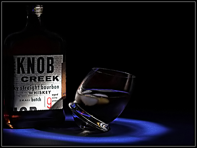
Exposure is okay, the problem is where your spotlight lands. In this case the main subject becomes the bottle instead of the glass since that's all you can see clearly. The glass is vaguely lit, making it hard to make out any details. For example, I can only assume the glass is teetering on an ice cube, as I can't actually see it. And my monitor is calibrated, your average voter's won't be and will appear drastically darker, eliminating even more detail.
Artistic : It's an decent idea, but I think your 'last minute' is showing through on the results. I think if you had more time to give it thought you could've improved on your idea, as well as your implementation of it.
Challenge : Meets the challenge.
Conclusion : I think it would have improved with some small lighting changes. But the biggest improvement would have simply been a little more thought put into it.
Hi Rikki, since you asked, gave you a 6. The reasons I like it:
- loved the blue "ring", reminded me of classy Manhattan jazz bar scenes, that kind of set-up
- the way the glass is tilted gives it some interest and originality combined with the lighting
Reasons I didn't vote it higher:
- in contrast to the "Manhattan" elegance, I found the bottle in a big way out of context. Rightly or wrongly, it seemed tacky compared to the elegance of the overall set-up.
- Meets the challenge ok but find the interpretation of the challenge rather soft. Nice but not that spot-on.
Having said that, this was a difficult challenge IMO.
Rikki - it is just a smidge too dark, in that the illusion would be lost to those with poor calibrated monitors.
It was one of my top picks (and i didnt have many in this challenge).
Very interesting image and well shot. Lighting and focus are good. Subject placement is well done. The added element of the glass shape itself really sets it up nicely. Well done!





 Add photograph to your favorites
 Add photographer to your favorites

 Photographer found comment helpful.


