Post:
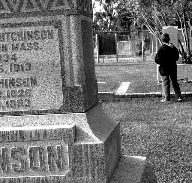
I really wanted tilted lines to reflex an uncomfortable, unstable mood I was going for. so I deliberately found a really old headstone that tipped to the left. But after seeing the comments, it seems that was what bothered folks most.
Hmm... I still like it this way tho. :)
Statistics
Place: 36 out of 105 Avg (all users): 5.4696 Avg (commenters): 6.5000 Avg (participants): 4.9853 Avg (non-participants): 5.6728 Views since voting: 891 Views during voting: 406 Votes: 230 Comments: 17 Favorites: 0
I have studied your image and have the following to offer:
Composition/perspective – first off…very emotive shot. You have captured a mood and feeling quite well. The focus of the shot is good and the distance to the main subject adds to the strength of the image. I read your comments and agree with the tilted stone. It is a shame others didn’t see it. It does add to the mood of the shot as you wanted in my opinion. It is not easy visiting a grave and you added that element without an awkward addition to the photo that wasn’t there naturally. I do find the background a little distracting to the mood though. It looks like a tennis court or some other recreational area (??) The foreground stone being cut off is a good element – makes you focus immediately to your subject. Subject placement via rule of thirds is done quite well. The subject takes up just enough space to be a force, but not too much to make you wonder why he is there. I also like that you cannot see his face and his apparent uneasiness in the location (as evidenced by his foot being slightly off the ground). Really adds to his presence in the shot. Overall well done!
Color – b/w, the conversion was properly executed. The shades across the shot appear even and the dark and light areas you would expect to be the same in shade are. Well done!
Lighting – natural light…well controlled exposure. The texture of the grass and the lines in the stones are well preserved. The jacket appears a little dark, but overall it is a very even exposure that is pleasing to the eye.
Challenge requirements – may have lost a bit here with the voters. You have to be willing to accept the setting to appreciate the force of the image. I noticed a few comments that did not like the tilted stone. I don’t think they spent enough time on the image to absorb the context. Just my opinion.
Overall/my opinion – this is not a shot to be judged on the technicals. They have been handled quite well in the image. But the subject matter may be a little too close to home for some, and too hard for others to grasp for whatever reason. But it is a strong image that was well thought out and executed quite nicely!
I like the idea of this shot, and the title gives it even more emotional impact. I think the main thing I would change for this picture is to take it in a more modern cemetery. The dates in the 1800's and the big wooden sign in the back throw the feeling off for me. Still, 7 for thoughtfullnes and emotional impact
Interesting photo but there's something really funky going on with the distortion. The headstone in the foreground is most distractingbecause it's tilted, I want to tilt my head to go along with the edge which causes other things to tilt the other way. The idea is good and black and white works well.
This is easily one of the best pictures and titles as far as meeting the challenge. I saw the connection from the thumbnail, which was not easy in this challenge. The thing that bugs me is the tilt, a few degrees of rotation or a longer lens would have nailed this. Still it is my highest scored photo, best of luck.
I think you have a smart idea here. The tilted foreground stone detracts from the boy in the background for me, but I like the use of black and white for this image.
i like this picture off-angle...i'm sure other DPCers will want the horizon line straightened. i wouldn't do it...being off-angle adds to the emotion of this image. great texture.





 Add photograph to your favorites
 Add photographer to your favorites

 Photographer found comment helpful.


