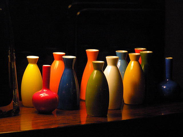
This was my first challenge and thank you to everyone who voted for me and commented! I'm very happy with my results. The basic editing restrictions were difficult for me - those background dots drove me crazy, but I felt if I cropped it more I would lose the sense depth that I was trying to achieve...
Not a bad first try though. I will take all comments into consideration next time!
Statistics
Place: 33 out of 210 Avg (all users): 5.6714 Avg (commenters): 6.2778 Avg (participants): 5.4022 Avg (non-participants): 5.8010 Views since voting: 1073 Views during voting: 395 Votes: 283 Comments: 20 Favorites: 1 (view)
I like the idea. Personnaly I think I would have restricted myself the use the vases in the middle with a similar shape only and gone in closer to fill more of the frame.
Good try! 5
Nice collection. The setup is good but dark. I would have liked it better if the side objects were cropped out (too dark) and the table edge cropped even - not shown at an angle. Maybe it's just my moniter.





 Add photograph to your favorites
 Add photographer to your favorites


 Photographer found comment helpful.


