| Author | Thread |
|
|
12/10/2005 07:28:59 PM |
Hello from the Critique Club!
I really like this image. It fits the challenge perfectly.
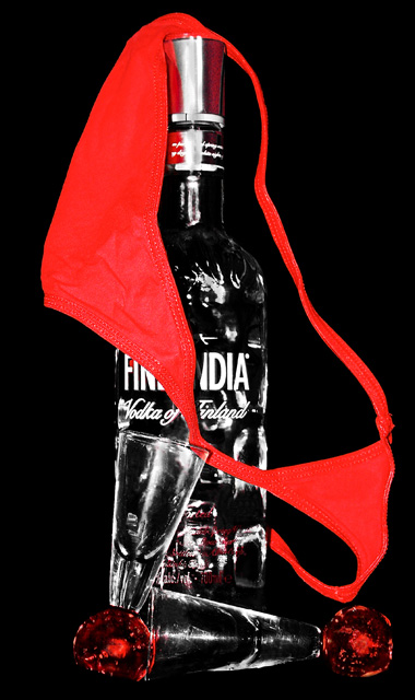
The first thing that stands out and makes this image powerful is the use of colour. The strong red and black gives it instant impact.
The second element is its graphic quality, achieved through the use of desaturation.
Compositionally, there is a wonderful triangle formed which is really pleasing to the eye, and which leads the eye from the top of the image to bottom.
The balance between positive and negative space is perfect.As is the balance between red and black. Both of these elements create an overall sense of 'rightness' for the viewer.
The lighting has brought out lovely highlights on the cap of the bottle, the writing around the neck and on the glasses. It also brings out the stitching on the underwear.
Overall, a really good, graphic image. |
|
Comments Made During the Challenge  |
|
|
12/01/2005 05:22:45 PM |
|
Good pic. The best, of the ones like this, I have seen. The red makes it pop! |
|
 Photographer found comment helpful. Photographer found comment helpful. |
|
|
11/29/2005 12:24:06 AM |
|
HA, very nice. I love it. Great color and a great idea. Good luck! |
|
| Photographer found comment helpful. |
|
|
11/28/2005 09:40:43 PM |
|
lol. Very funny. There is an attempt to eradicate tonal values for effect. I would have simply exposed 100% for the underwear. However, as a semi graphical representation the image remains a strong visual. |
|
| Photographer found comment helpful. |
|
|
11/28/2005 05:46:20 PM |
|
i like the harshness of the white and red in this image. it really adds to that "one too many" feeling... |
|
| Photographer found comment helpful. |
|
|
11/28/2005 12:23:51 PM |
|
you clipped out a litle too much detail in the higs/lows for my taste. i would have like to see the logo in full also, nice colors and composition though. |
|
| Photographer found comment helpful. |
|
|
11/28/2005 04:58:00 AM |
|
| Photographer found comment helpful. |
|
|
11/28/2005 03:30:14 AM |
|
its a good image but too stark, I dont thik the black background helps 7 |
|
| Photographer found comment helpful. |
Theme:
Classic /
Light /
Dark
Home -
Challenges -
Community -
League -
Photos -
Cameras -
Lenses -
Learn -
Help -
Terms of Use -
Privacy -
Top ^
DPChallenge, and website content and design, Copyright © 2001-2026 Challenging Technologies, LLC.
All digital photo copyrights belong to the photographers and may not be used without permission.
Current Server Time: 10/16/2026 01:57:35 PM EDT.







 Add photograph to your favorites
 Add photographer to your favorites


