- RAW capture
- 10 pops of two 300 w-s strobes (shoot-thru
umbrella and soft box, both at ~ 1/32 power,
followed by
- Painting with light ("mini-mag" flashlight)
- 45s exposure at f/22
- Color temp adjust
- Convert to PSD
- Re-size
- Dodging/burning
- Spot healing brush here & there
- Localized sharpening
- Boost saturation
- Brightness/contrast
- Save for web
- Submit
- Wait and see :)
Statistics
Place: 29 out of 105 Avg (all users): 5.5385 Avg (commenters): 7.0000 Avg (participants): 5.3125 Avg (non-participants): 5.6306 Views since voting: 1233 Views during voting: 393 Votes: 221 Comments: 19 Favorites: 0
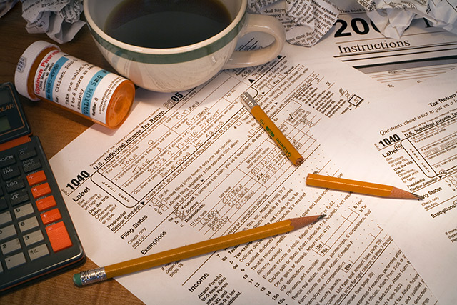
I think this is an excellent idea and hits the challenge perfectly. The only real problem for me, is that it's just not a visually appealing photo. Technically, I think it's well done. Good focus and clarity. We get nice details in the words and we get to see the humor in the shot.
Lighting is good, there are no horrible hot spots or distracting shadows. I think that's really important because of the words, if you get bad lighting, all the words would be unreadable and this shot wouldn't have as much humor value.
I do think it's a bit crowded. I think one of the pencils and the other 1040 form on the right could be removed without hurting the photo. It just seems like too many items crammed into the photo and feels very set up. TOO set up. Of course, I'd have to actually SEE it without the pencil and paper to determine if it looks better that way, or if it then seems to be missing something, but definately it seems like it's too forced.
Overall, it's technically good and a great idea, just lacking some visual punch.
~Heather~
Thanks for the critique, Heather. I appreciate the time you spent analyzing and commenting and I welcome all who are interested in providing useful, constructive (positive or negative) feedback, to comment on or provide an in-depth critique of any of my work, either openly or via PM.
It's a given that a good photograph speaks for itself with little or no additional "explanation" necessary. However, by way of going a little deeper than the immediate, superficial layer of understanding, I submit the following thoughts for the viewers' consideration (quoting, in part, from the critique, above):
I do think it's a bit crowded. It's crowded to reflect the "crowded', busy life of an adult.
I think one of the pencils and the other 1040 form on the right could be removed without hurting the photo. It just seems like too many items crammed into the photo... There are two pencils because one is broken (as a result of stress and tension - the guy's on tranqulizers for a reason! LOL! BTW, the presription label is totally home made & put onto an allergy pill vial). It's not at all uncommon to have a spare pencil handy. If one looks closely, they see that the "other 1040" is actually the sample sheet (part of the instructions). The instructions are included because they are frequently more of a source of anxiety and irritation than a help. As for "too many items crammed in...", there are plenty of people who have to literally clear off just the corner of a table or desk to make room to perform a task like writing a letter or filling out a form because their kids or spouse have the rest of the space occupied with their own "projects".
Of course, I'd have to actually SEE it without the pencil and paper to determine if it looks better that way, or if it then seems to be missing something, but definately it seems like it's too forced.
Overall, it's technically good and a great idea, just lacking some visual punch. I did see it without these elements (pencil & paper) in several of the out-takes leading up to the final version. It did not convey the sense of crowding that I was after (and thankfully, achieved). I made the lighting as flat and "boring" as I could - while, at the same time, trying to hold detail - again in reference to the boring, routine nature of so many aspects of adult life.
Thank you (and everyone else), again, for your comments. I wish everyone at DPC a happy, healthy, prosperous New Year! God Bless!
I think this is an excellent idea and hits the challenge perfectly. The only real problem for me, is that it's just not a visually appealing photo. Technically, I think it's well done. Good focus and clarity. We get nice details in the words and we get to see the humor in the shot.
Lighting is good, there are no horrible hot spots or distracting shadows. I think that's really important because of the words, if you get bad lighting, all the words would be unreadable and this shot wouldn't have as much humor value.
I do think it's a bit crowded. I think one of the pencils and the other 1040 form on the right could be removed without hurting the photo. It just seems like too many items crammed into the photo and feels very set up. TOO set up. Of course, I'd have to actually SEE it without the pencil and paper to determine if it looks better that way, or if it then seems to be missing something, but definately it seems like it's too forced.
Overall, it's technically good and a great idea, just lacking some visual punch.
~Heather~
this is exactly one that I thought of doing, although I was just going to have an aspirin bottle. You executed it far better than I could have. Good job.





 Add photograph to your favorites
 Add photographer to your favorites


 Photographer found comment helpful.


