rotate 90; scale image; USM, sharpen, levels, curves, hue, and saturation on various selected layers; add border
------------------
Whoops--how could I forget to mention that I cropped the heck out of it? Heheh...
Thanks for the comments! And multiple favorites--wow.
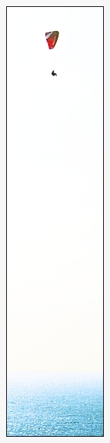
A few people mentioned that they didn't like the border. The reason I included one was to accentuate the "verticalness" beyond the 640 x 160 ratio DPC limitation--since the border width is constant, by adding a border it makes the extreme crop even more extreme. Not that I disagree with the commenters--if I had it to do over, I might very well leave it out. Resolution is a precious commodity.
My main self-criticism is with the lack of detail in the subject. I'm still learning how to do post-processing, and this was the best I could do with what I had.
Also, I regret naming it "Up". Originally I had it named "Altitude", but changed it at the last minute to make it shorter. I didn't realize until later that the name conflicted with Joey Lawrence's tres cool Up photograph. I view the real title of my entry to be "Altitude".
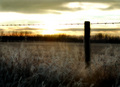
And, as one commenter accurately surmised, the original is not much to look at. :-} Here it is for kicks 'n grins.
Finally, I had another entry that I thought was "safer", but decided to go with a more extreme entry. My score probably suffered, but I don't regret it.
Statistics
Place: 299 out of 519 Avg (all users): 5.3653 Avg (commenters): 6.6667 Avg (participants): 5.3889 Avg (non-participants): 5.3014 Views since voting: 1173 Views during voting: 595 Votes: 271 Comments: 23 Favorites: 3 (view)
I was surprised you didn't get a better placing with this. I am sure the fact it was cropped differently and so small may have hurt it. I felt it was very unique and deserve higher than it got.
I'm betting this is pretty cool full size, assuming you have the necissary resolution, but with only 640 pixels to work with I think it looses a lot of it's impact. For a shot like this (that's already pushing the limits the pixel allowance), I wouldn't have wasted space on a border. It's actually rather distracting since it takes up so much of the frame.
Unique concept, but too overexposed for my liking (the edge around the parasailer looks uneven because of it) and too much white space to keep the interest of the viewer for long.
A clean uncluttered image with just the sea below and the parasailer high above. Cropping is good for it calls attention directly and instantly to the main focus - the parasailer sailing high above the ocean waters. It also gives the viewer a sense of height and distance. My only critiques on improving the image would be that the color on the parasail be more richer in hue such that it really pops of the page - here it looks a little washed out. Also if the parasailer could be in sharper focus such that more details are visible would be good.
6 - Like the concept. Criticism; obviously the size restrictions don't do this justice but even still, it seems too 'high key'/contrasted to the point where too much detail, especially in the 'sail' has been lost. Be nice to be able to 'discern' the horizon a little better (I can barely now), and have some more 'color' in the emptiness in between, somehow, while still retaining the concept you've gone for - if that makes sense. Wall size this might look much better, but again, my opinion, if you had have 'adjusted' this to try to suit it to this medium, especially for this Challenge, would have helped you a lot but who knows. The frame detracts in my opinion, especially at this size. Again, perhaps it would work 'wall size', but even then I can't see it actually 'enhancing' this shot/concept.






 Add photograph to your favorites
 Add photographer to your favorites

 Photographer found comment helpful.


