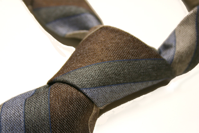
Great composition. Did you think of using a more brightly colored or more interesting tie? Or was the point to express blah-ness? In any event, I'd rather see a more exciting tie. Overall, nice job.
a classic, simple composition that's very appropriate for this challenge. the brown stuff under the left part of the tie detracts from the photo, and it's a shame because this image's simplicity would have made it a contender in my book.
Love the composition and color...I question if maybe you did a bit too much editing...I'm noticing some major noise and unnatural color variation around the tie, looks like some magic wand use was done here.
Very nice tie shot. There are a few distracting points... the bright spot in top right corner, the tan streaks fanning out from knot on left side and the odd spots along bottom that look like bad attempts to clone something out.
The simplicity of this works. Great detail of the weave of the tie. I like the askew sense of it like coming home and just throwing it off. It works well in combination with an excellent title.
There is a lot of visible "eraser" marks surrounding your necktie, the majority of which is underneath the knot itself. Hmmm. While the image is itself is ok, I think this would have been great had the dimple been included in the knot itself. This looks like a Four In Hand knot :) The edges seem a bit harsh possibly due to the removal of some elements i.e. the background. Good try but this image requires a bit more PP to be convincing. 5






 Add photograph to your favorites
 Add photographer to your favorites

 Photographer found comment helpful.


