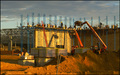
This is a picture where the colors don't do much for us. They are fairly muted and somewhat drab. There is a hint of nice blue in the corner, but the sky is mostly white/gray as well. When I see this I automatically think B&W. Chuck the color. It isn't helping. Go into Photoshop and open your picture and hit ctrl-1 which should bring up the red channel in B&W. Immediate help. Now we are drawn to the geometric patterns and textures in the building.
I thought the contrast was flat, but I couldn't improve it much in PS, so you are probably fine there.
The composition is too centered. This leads to a static image with little dynamics.
The focus is good and exposure is nice too.
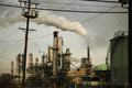
I think the big problem here is it was up against another 50 pictures of industrial buildings just like it. There was no additional dimension to this photograph. Others either had it at night (so we had the dimension of light or motion blur with smoke), or had billowing smoke (dimension of activity), or still others had more rundown buildings. This certainly fits the challenge, but doesn't do a whole lot on top. When you have to compete with lots of pics that are alike, you need that extra something to make your's stand out.
A 5.2 is actually not a bad score for this and I think it was people rewarding you for proper focus and exposure.
Technically, everything in your photo is dead-on. Your focus is sharp, exposure is perfect. But, the photo has no wow factor in a challenge loaded with industrial buildings. A braver composition may have given it the wow. Overall, it was just a hard challenge to please voters in.
I like the perspective and the composition but it's screaming post editing to me. Sepia? Or perhaps black and white? Maybe adjusting curves would have given it some oomph. 7






 Add photograph to your favorites
 Add photographer to your favorites

 Photographer found comment helpful.


