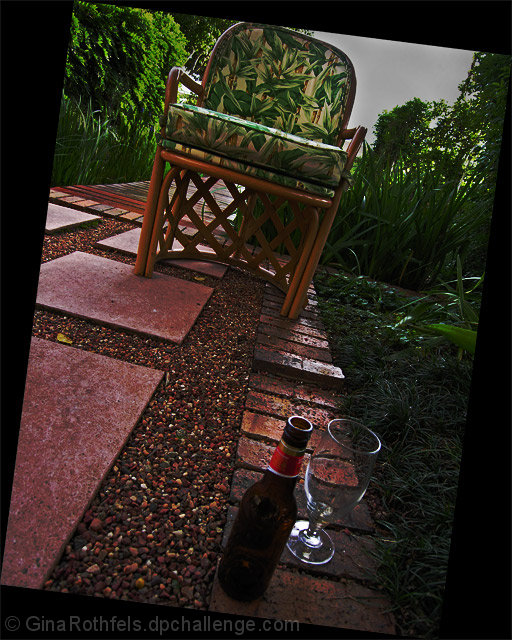
First impressions -- My first impression is that the cock-eyed framing of this picture really fits with the title. Kinda like it is just falling over -- it is off-balance, but again it fits.
Composition -- I like how you use the bottle and the glass to lead to the chair via the path. That seems to be an effective use of leading lines, and it gives the picture some dynamics that would not be there if they wer aligned straight, I think. It also helps to balance the picture between the foreground and background.
Technically, the focus is okay, and I like the contrast of the red and green in this shot. However, it feels as if it was too dark and you brightened/lightened it in postprocessing adding a grainy feeling to it. If you were using a tripod, maybe using a slower shutter speed would have helped, but I imagine exposure was a bit of a problem because it looks like a slower shutter may have blown out the sky.
Your picture and dpc voters. I suspect what "hurt" your shot is the oddity of the frame/composition, even though many did appreciate it and see the relevance, there were probably those that did not. Also, as mentione, the focus seems okay, but it seems to have a bit of "grain" (not like traditional film grain/digital noise -- more of a "roughness").
Interesting approach, and best wishes in future challenges.
I'd have placed the bottle and glass closer to the chair so you don't have to scroll so much to get the whole picture. Since when does drunkeness imply adulthood?
This is a bit of a sleeper this one. I was going to write it off as silly - but it has something. Good light and DOF, saturation is attractive. Technically this score well. Not sure about the crazy angle and if the drink had been consumed, the glass would be dirty.






 Add photograph to your favorites
 Add photographer to your favorites

 Photographer found comment helpful.


