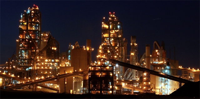
7 - Very nice, looks futuristic. I'm sure the size restrictions don't do this justice. Criticism; difficult to tell, but the 'level' seems a fraction out, apologies if wrong (makes 0 difference to my score). I want to suggest perhaps more space on the right, but this works well, especially with the 'belts' or roads, whatever they are, in symmetry like this, so who knows. Seems to be 'something' top right too, no idea what. Perhaps if you'd gone for more height incorporation here might have helped this in this medium, but you'd lose the 'wide aspect' you've obviously gone for so, difficult. 2nd look, I think this is 'level', just the ground variations 'deceive the eye', especially at this size.





 Add photograph to your favorites
 Add photographer to your favorites


 Photographer found comment helpful.


