Author Thread Comments Made During the Challenge
Post actions
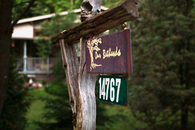
Nice photo. Shows your opinion of your home.
Post actions
the angle of the sign is awkward for the subject of your composition.
Post actions
Would have liked to see the sign placed to one side of the photo.
Post actions
I would have liked ALL of the sign in focus myself
Post actions
I like this shot, grest composition, good lighting and well focus. Keep it up.
Post actions
not too bad... nothing spectacular here though
Post actions
cool perspective and DOF.
Post actions
nice, but probably has more meaning for the owner, that we could not possibly understand
Post actions
This would have been better from a different angle.
Post actions
Post actions
Good composition, simple but to the point. Very nice. I like it very much!
Post actions
I don't think the sign should have been dead center in the image.
Post actions
The focus is annoying. The background is fine, but the letters on the sign seem to need something - a different angle and/or better focus.






 Add photograph to your favorites
 Add photographer to your favorites


 Photographer found comment helpful.


